
Set two paragraphs at font-size: 16px in two different fonts and one of them will be noticeably harder to read. Not because one font is badly drawn, but because the number in your stylesheet does not describe the size of the letters.
We measured 54 open-source font families to find out how much that matters. The answer is: more than we expected, and enough to break one of the rules in the accessibility guidelines.


What font-size actually sets
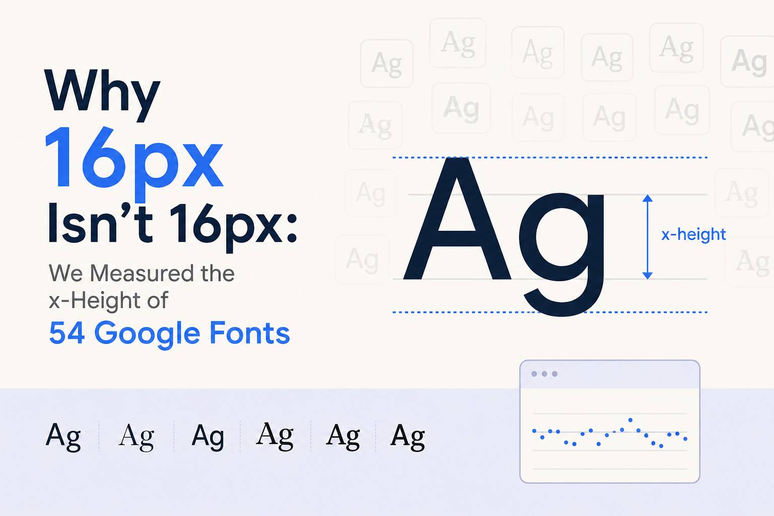
font-size sets the size of the em box — an invisible container the type designer draws inside. How much of that box the lowercase letters occupy is entirely the designer’s decision, and it varies enormously.
The measurement that matters is x-height: the height of a lowercase “x”, expressed as a fraction of the em. That is what you are actually reading. Capitals and ascenders help, but the bulk of running text is lowercase, and its size is set by x-height rather than by font-size.
How we measured it
Every figure here is read out of the font binaries, not from a vendor’s metadata. x-height and cap height come from the OS/2 table (sxHeight and sCapHeight), normalised by head.unitsPerEm so families with different internal grids are comparable. Weight ranges come from the fvar axis where a variable font provides one. Advance widths are resolved through cmap into hmtx and averaged over a–z.
The full dataset — 54 families, 27 fields each — is published on GitHub under CC0, along with the extraction script. Nothing below has to be taken on trust.
Finding 1: x-height varies by 74%
Across the 47 non-display families, x-height as a fraction of the em runs from 0.332 to 0.578. The median is 0.506.
| Largest x-height | ratio | Smallest x-height | ratio |
|---|---|---|---|
| Oswald | 0.578 | Dancing Script | 0.332 |
| Merriweather | 0.555 | Josefin Sans | 0.378 |
| JetBrains Mono | 0.550 | Cormorant Garamond | 0.386 |
| Poppins | 0.548 | EB Garamond | 0.400 |
| Inter | 0.546 | Crimson Text | 0.420 |
The largest sets lowercase letters 74% bigger than the smallest at identical font-size. That is not a subtle difference. It is the difference between comfortable body text and text your readers quietly give up on.
Finding 2: the size you need to match, in practice
This is the part worth bookmarking. Inter at 16px puts 8.73px of lowercase on the page. Here is what every other popular family needs to be set at to produce the same reading size:
| Family | x-height | Lowercase at 16px | Size needed to match Inter |
|---|---|---|---|
| Poppins | 0.548 | 8.77px | 15.9px |
| Inter | 0.546 | 8.73px | 16.0px |
| Open Sans | 0.535 | 8.56px | 16.3px |
| Roboto | 0.528 | 8.45px | 16.5px |
| Montserrat | 0.517 | 8.27px | 16.9px |
| Playfair Display | 0.514 | 8.22px | 17.0px |
| Lato | 0.506 | 8.10px | 17.2px |
| Work Sans | 0.500 | 8.00px | 17.5px |
| Nunito | 0.484 | 7.74px | 18.0px |
| Source Serif 4 | 0.475 | 7.60px | 18.4px |
| EB Garamond | 0.400 | 6.40px | 21.8px |
If you swap Inter for EB Garamond and leave the size at 16px, you have shrunk your body text by more than a quarter without changing a number that looks like it controls size. To get back to where you were, you need 21.8px.
This is why “we changed the font, and now it feels cramped” is such a common complaint after a rebrand — and why raising font-size by a point or two usually fixes it.
Finding 3: WCAG’s large-text rule is granted on the wrong number
This is where the measurements stop being a curiosity.
WCAG 2.x requires body text to meet a contrast ratio of 4.5:1. It relaxes that to 3:1 — a third less contrast — once text reaches 24px at normal weight, on the reasoning that larger text is easier to read at lower contrast.
The threshold reads the stylesheet. It does not read the font.
- Inter at 16px puts 8.73px of lowercase on the page, and must meet the full 4.5:1
- EB Garamond at 24px puts 9.60px of lowercase on the page, and is allowed 3:1
The Garamond letters are 10% larger. For that 10%, they are permitted a third less contrast. A designer can pass an audit by picking a small-x-height font and setting it at 24px, while a more legible combination fails.
This is a known limitation of a formula written in 2008, and it is part of why APCA — the perceptual contrast model drafted for WCAG 3 — accounts for font size and weight rather than applying a flat cutoff. If you are checking contrast seriously, check both: our contrast checker reports WCAG 2 and APCA side by side, because they disagree often enough to matter.
Finding 4: don’t trust OS/2.xAvgCharWidth
Fonts declare an average character width in their OS/2 table. If you are estimating how much text fits on a line, it is the obvious field to read. It is also frequently wrong.
Compared against the mean advance over a–z measured from hmtx:
| Family | Declared | Measured | Off by |
|---|---|---|---|
| Poppins | 0.851 em | 0.561 em | 52% |
| Lobster | 0.594 em | 0.443 em | 34% |
| Pacifico | 0.615 em | 0.459 em | 34% |
| Roboto Condensed | 0.567 em | 0.441 em | 28% |
| Dancing Script | 0.497 em | 0.389 em | 28% |
It is also not discriminating. Five groups of families in this set declare an identical value while their real widths differ — Domine and Lobster both declare 594, but their measured widths are 0.113 em apart. Anything sizing text from that field is working from a number that does not describe the font.
Finding 5: seven families have no real bold
Abril Fatface, Anton, Bebas Neue, Lobster, Monoton, Pacifico and Righteous ship no weight at 700 or above. Applying font-weight: bold to any of them produces a synthetic bold — the browser smearing the outline — rather than a drawn one. It looks muddy at small sizes and is a common cause of headings that appear slightly blurred.
Forty of the 54 families are variable fonts, so in most cases the available weights come from an fvar axis rather than from separate files.
What to do with this
- When you change fonts, re-set the size. Keeping 16px across a font swap is not keeping the design the same.
- Treat 24px as a floor, not a licence. Hitting the WCAG large-text threshold does not mean your text is comfortable to read.
- Check bold exists before you rely on it, particularly with display faces.
- Measure, don’t read the metadata.
hmtxis reliable;xAvgCharWidthis not.
The data
All 54 families with every measurement are on the font contrast tool, where you can check any of them against your own foreground and background colours and see the x-height rendered rather than described.
The raw dataset is on GitHub as JSON and CSV under CC0 — no attribution required, though a link back is welcome. The font files themselves are not redistributed; each is OFL and available from Google Fonts.